|

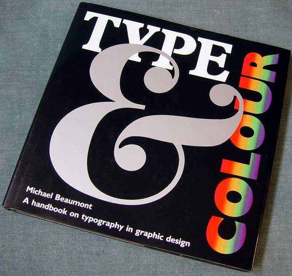
From the dust jacket: "The
right or wrong choice of typeface can mean the difference between
award-winning design and failure. But choosing the right typeface
can be a difficult task, made even more daunting when you have to
consider color as well. In Type and Colour you will find a lively
and practical approach to the subject with over 400 examples of
typographic design from the top design studios on both sides of
the Atlantic.
For ease of reference, the book is divided into two sections. The
first looks at typography and black letter forms, and an exciting
range of examples demonstrates how to exploit and manipulate
simple type shapes to make striking designs. The author shows you
how to choose different typefaces to alter the appearance of a
block of text, judge letter and word spacing, mix faces
successfully, and break some of the standard rules of typography
to produce innovative designs.
The second section introduces the added dimension of colour. You
will see the effects of colour in and with type, learning that
bright reds or oranges are aggressive and striking, that pastel
pinks, yellows and greens are soft and feminine, and that gold,
maroon and royal blue can exude sophistication and a sense of
quality. The author provides numerous examples of successful (and
sometimes not-so-successful) uses of colour and explains why
particular colours are chosen for particular jobs.
Another key consideration in good type design is how the finished
work will be used - whether you are choosing a typeface for a
pizza carton, a magazine advertisement, or a shop front sign. The
illustrations found throughout the book will help you learn to
make this subtle, yet very important, connection between type and
its intended use"
|